
Ramsey+ Cancelation Flow
Overview
Our product marketing team noticed through data analysis and customer interviews that users were getting to the end of their membership and not fully using the tools and content that was being provided by the Ramsey+ membership that they had purchased. A lot of factors added up to this but one of the main problems is the users could be coming from a lot of different entry points into the product.
Platform
Desktop Web
Mobile Web
My Role/Tasks
Product Designer
Product Marketing Designer
Prototype
Ideation Leader
UX Research
Problem Statement
Members aren’t taking advantage of the full suite of financial planning and learning products. Various entry points to the site from different marketing funnels do not provide users with the gambit of knowledge and information our membership has to offer.
Opportunity
How might we communicate the value of the products that the user might have missed, when we have their full attention?
Goals
Capture the users full attention, but still be helpful
If we are going to interrupt their flow, let’s do it in a way that is truly helpful.Reveal whatever tools and/or content they have missed out on
Users are not seeing everything they have purchased.
Ideation
So we gathered for an ideation to come up with hypothesis to the answer to the question, “Where are opportunities to show the customer the value of our product?”.
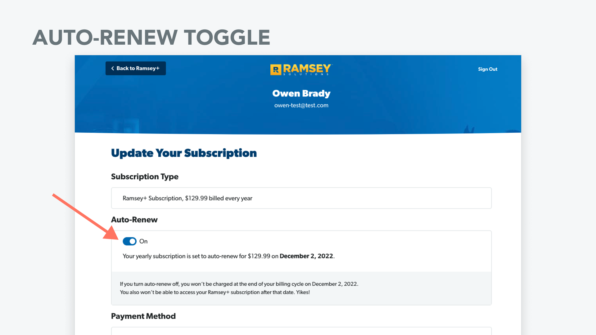
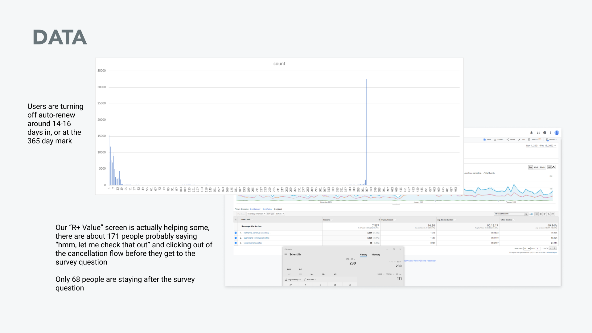
One of our ideas coming out of the ideation focused on the group of people who were turning off their auto-renewal membership by clicking a toggle switch. We had an experience in place for this, but we had a hypothesis that it could be better.
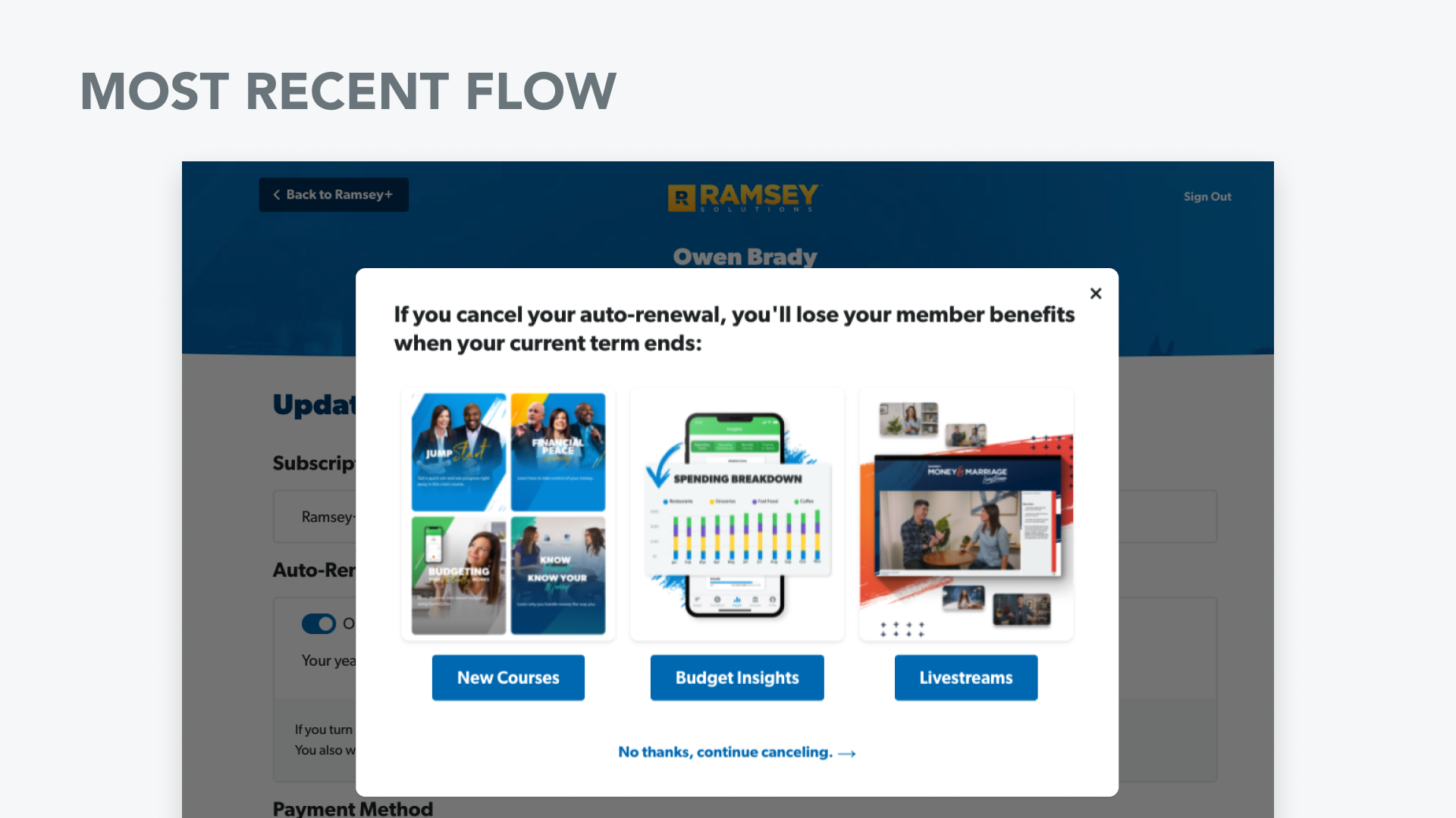
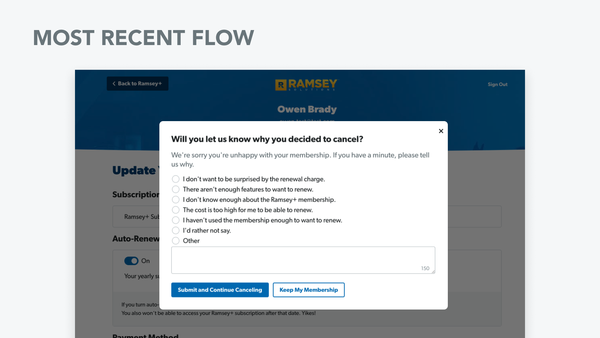
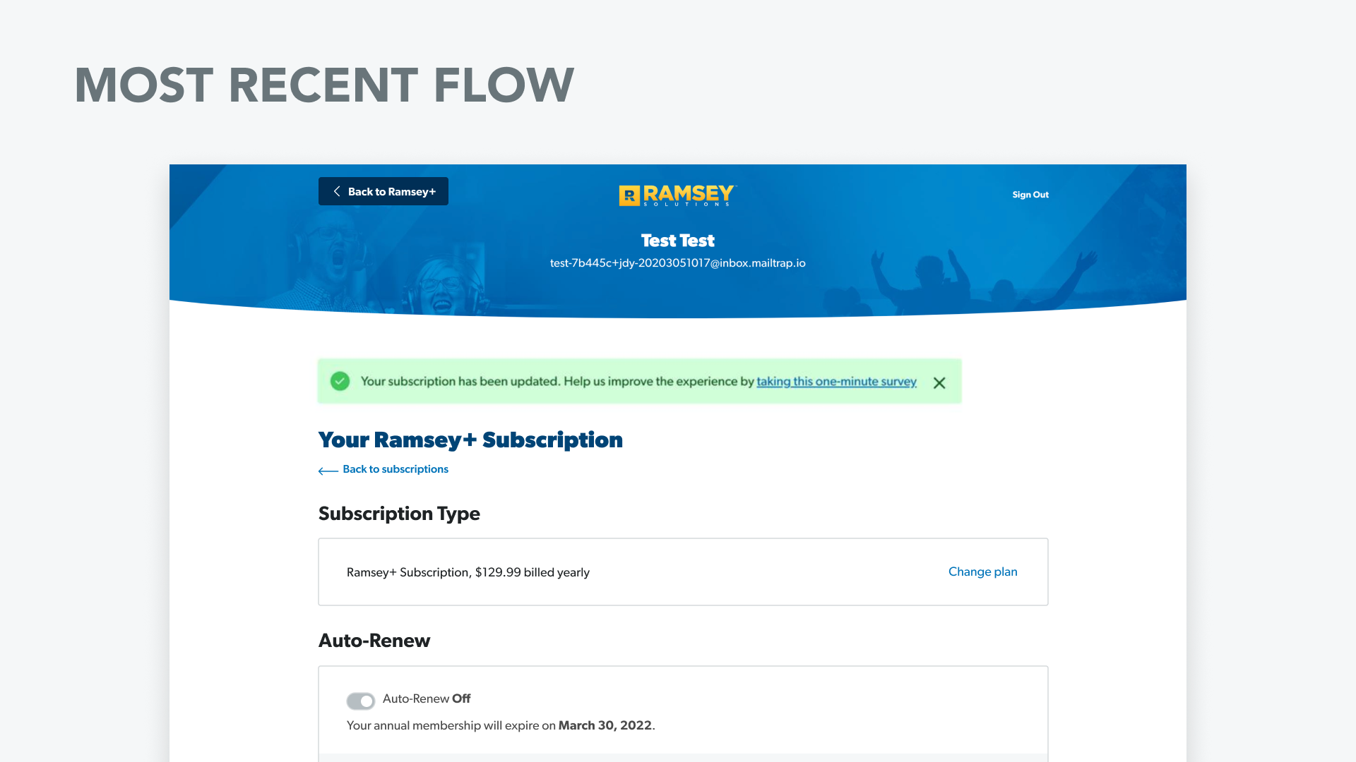
A lot of these people were receiving our friendly and helpful “ Hi, your membership is about to renew” email, and turning it off. The existing experience was composed of a value screen, a survey question asking why they wanted to cancel, then a confirmation screen once they submitted their answer.
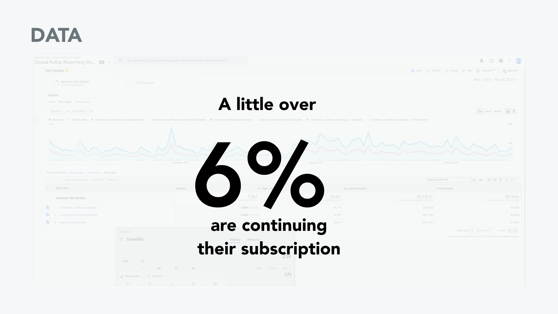
Working with our data analyst to get a baseline of how many users were continuing their membership, we found out only 6% of users were continuing their membership after that experience.
So after confirming that was the best path forward, I went off and did a quick competitive analysis on what other companies with subscription models do for cancellation/auto-renew off experiences.
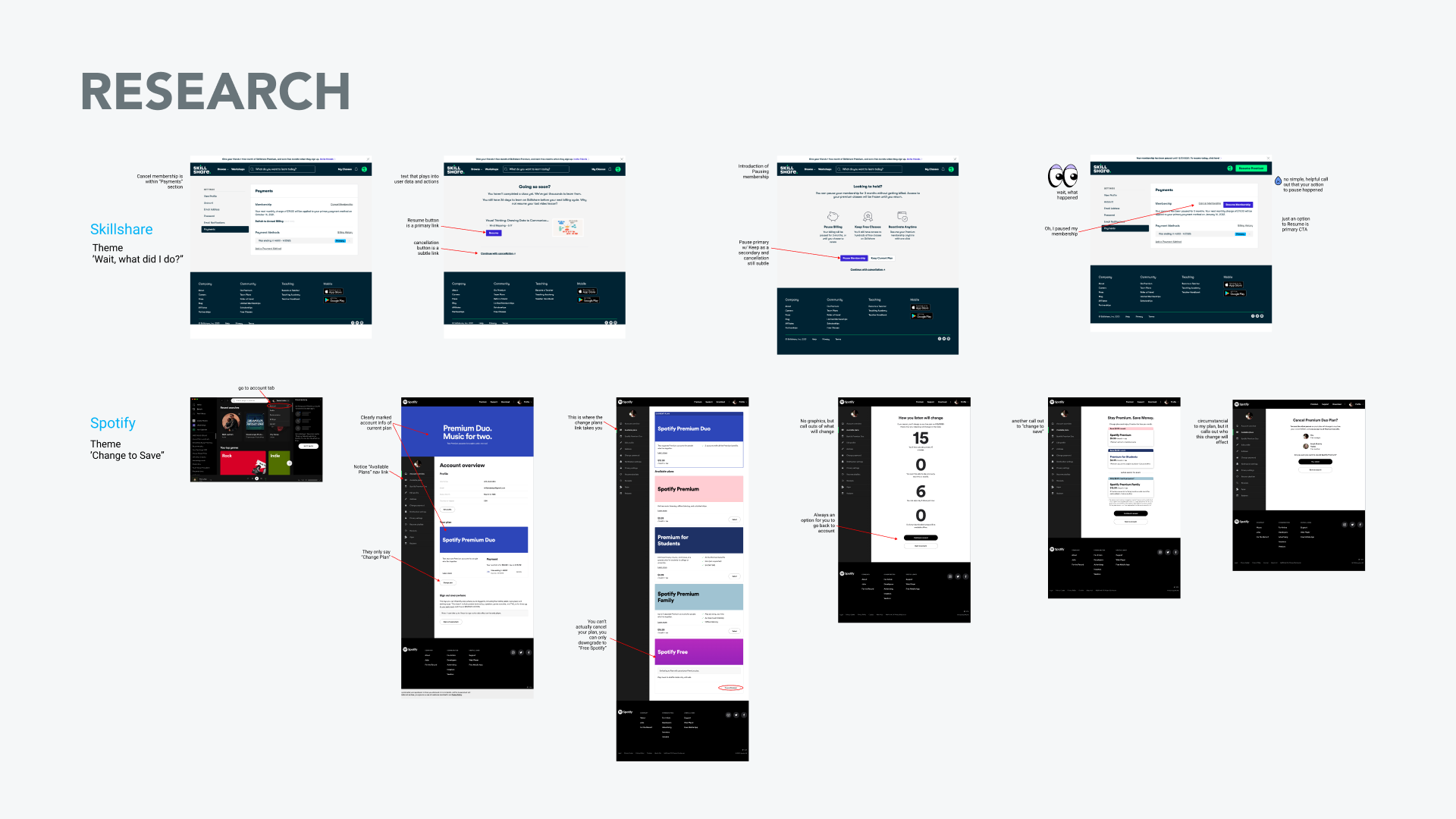
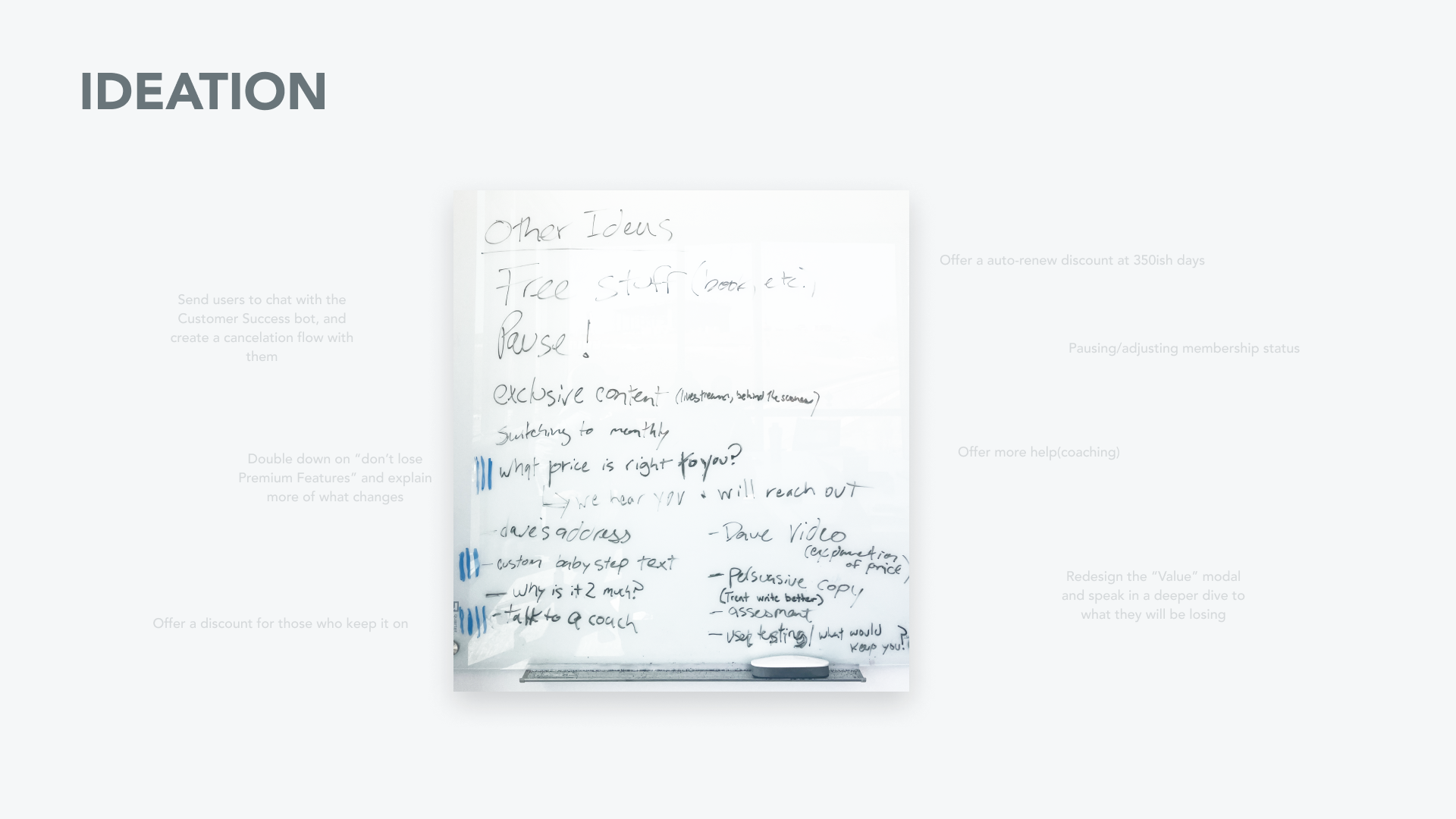
After seeing what other companies were offering their users, we had a quick ideation to see come up with ideas with what we could offer users. It was a balance of engineering feasibility , business decision making, and good experience for the user.
I created a few test flows to show some options we could move forward with:

As a team we decided that talking to the user, and creating custom experiences for their reasons for cancelling would be best moving forward.

This is currently being built and tested. Results TBD.
Product Team
Senior Product Marketer - Shelby Burr
UI/UX Design, Design Research - Daniel Hobbs
Engineering - Owen Brady
Project Management - Ben Hutton